Cravings Fine Food
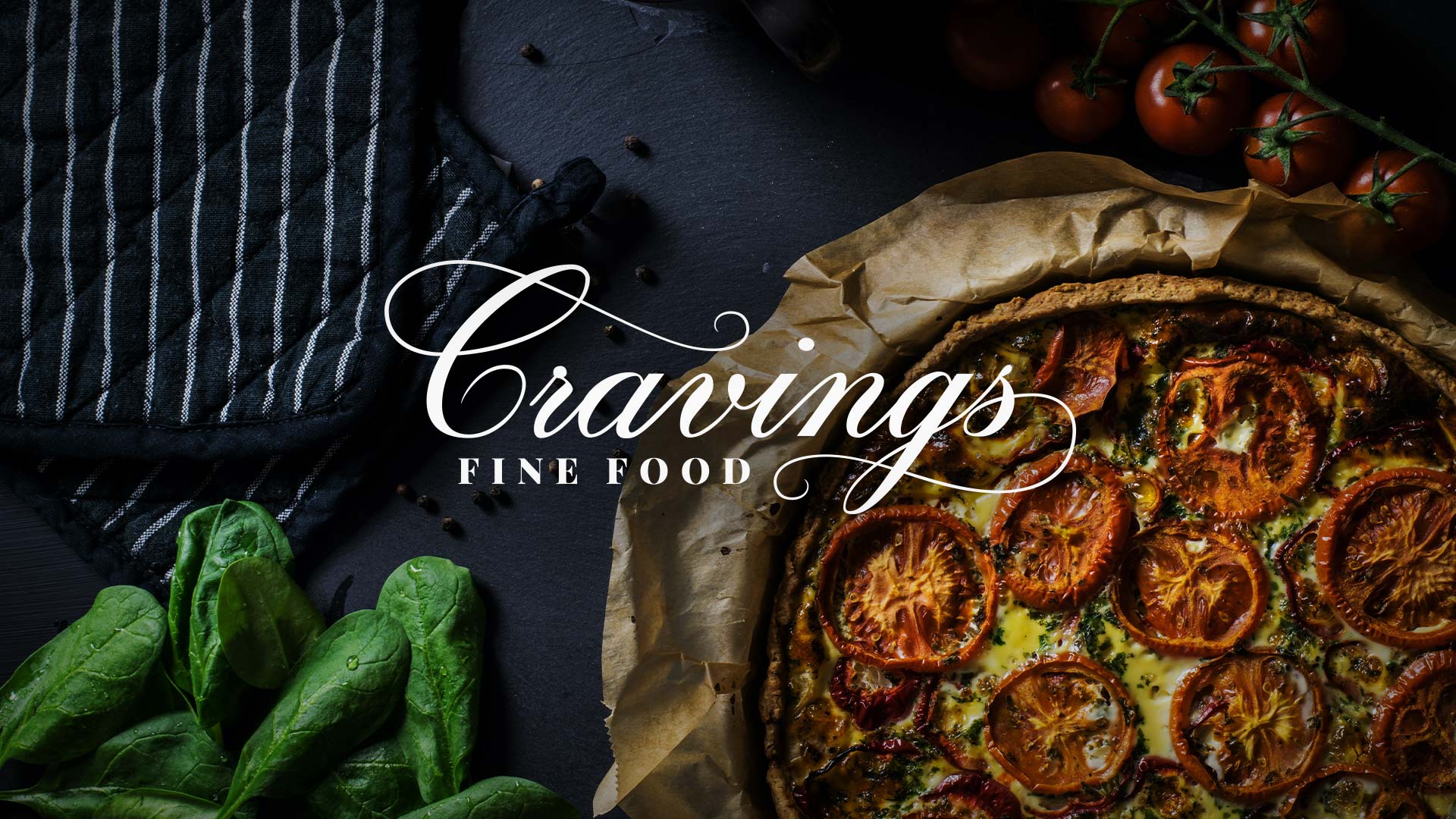
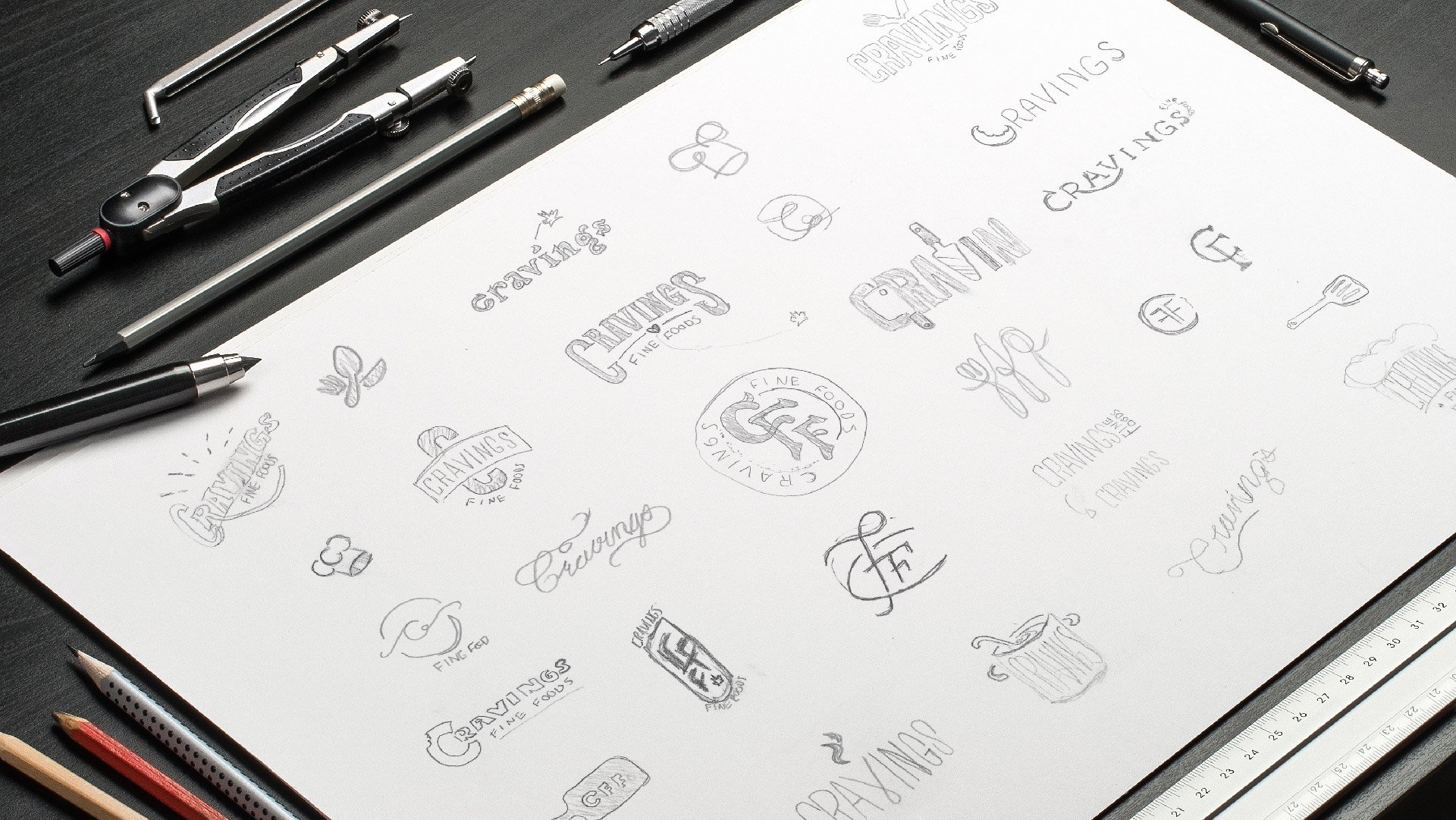
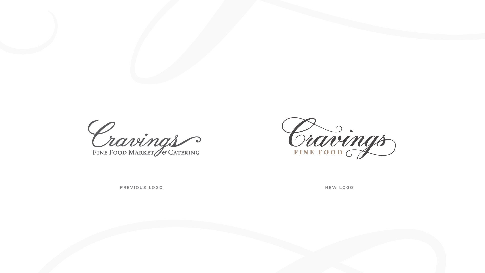
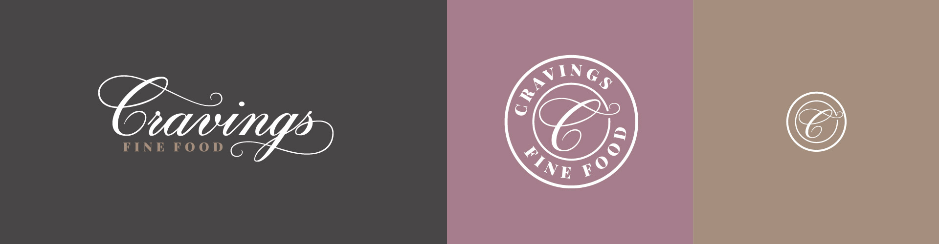
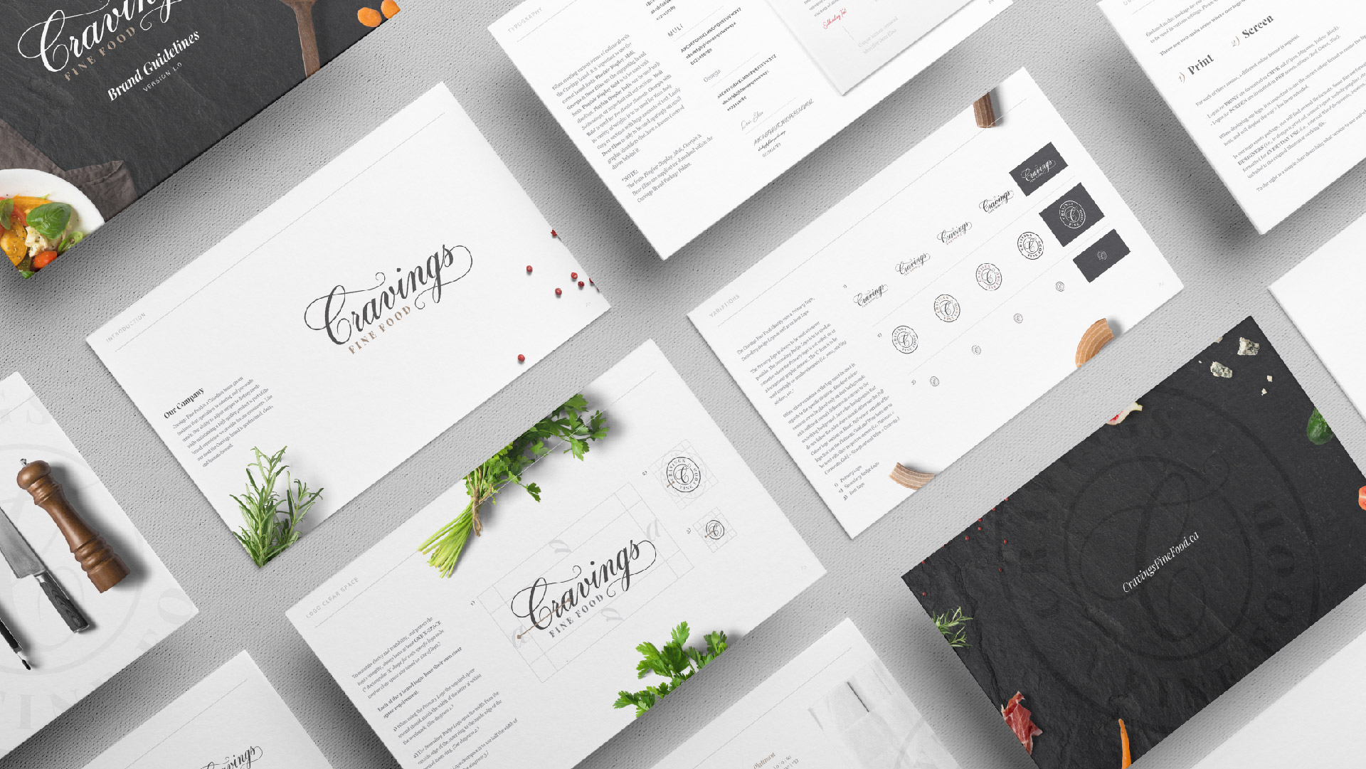
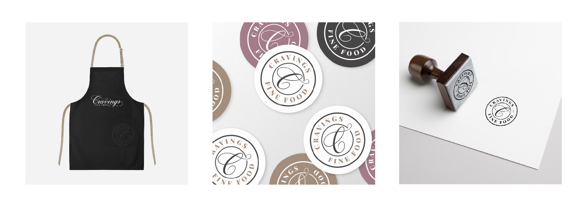
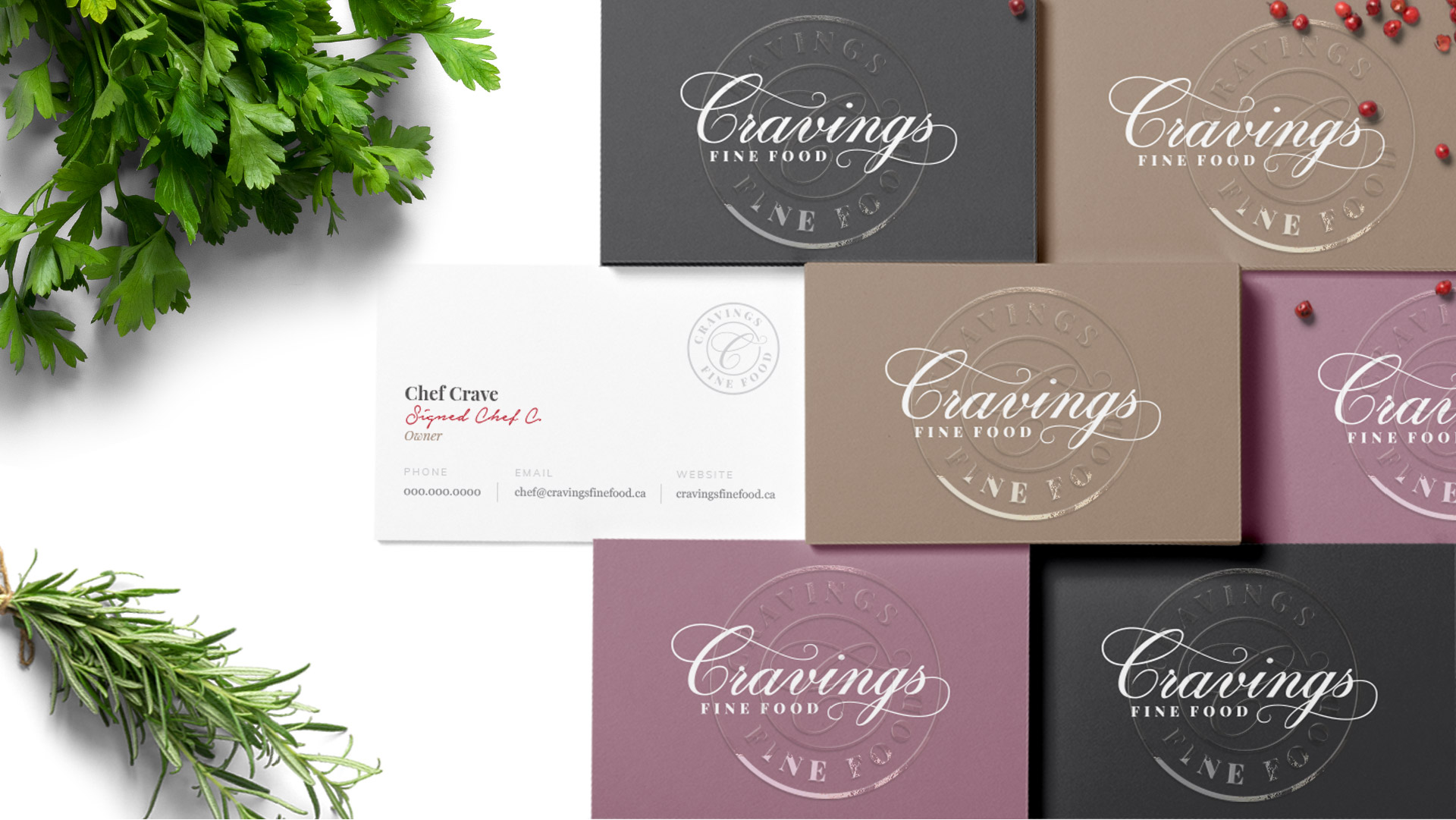
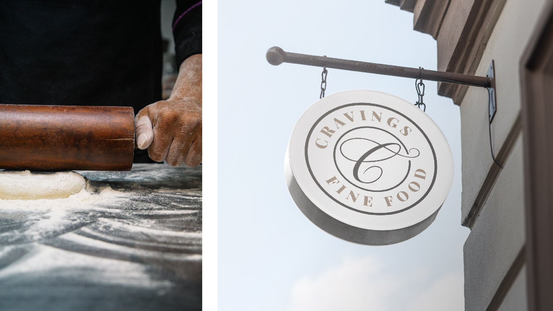

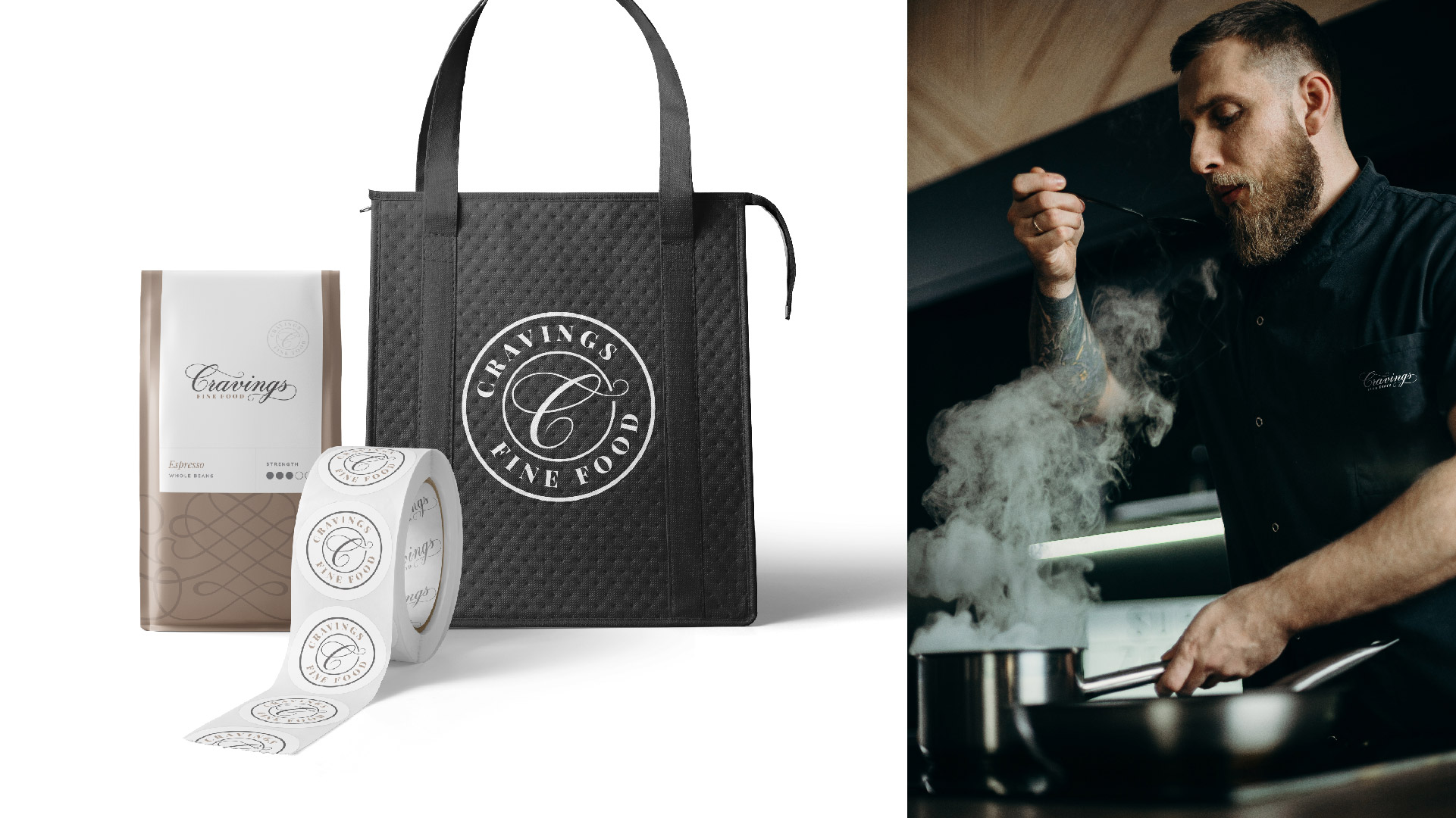
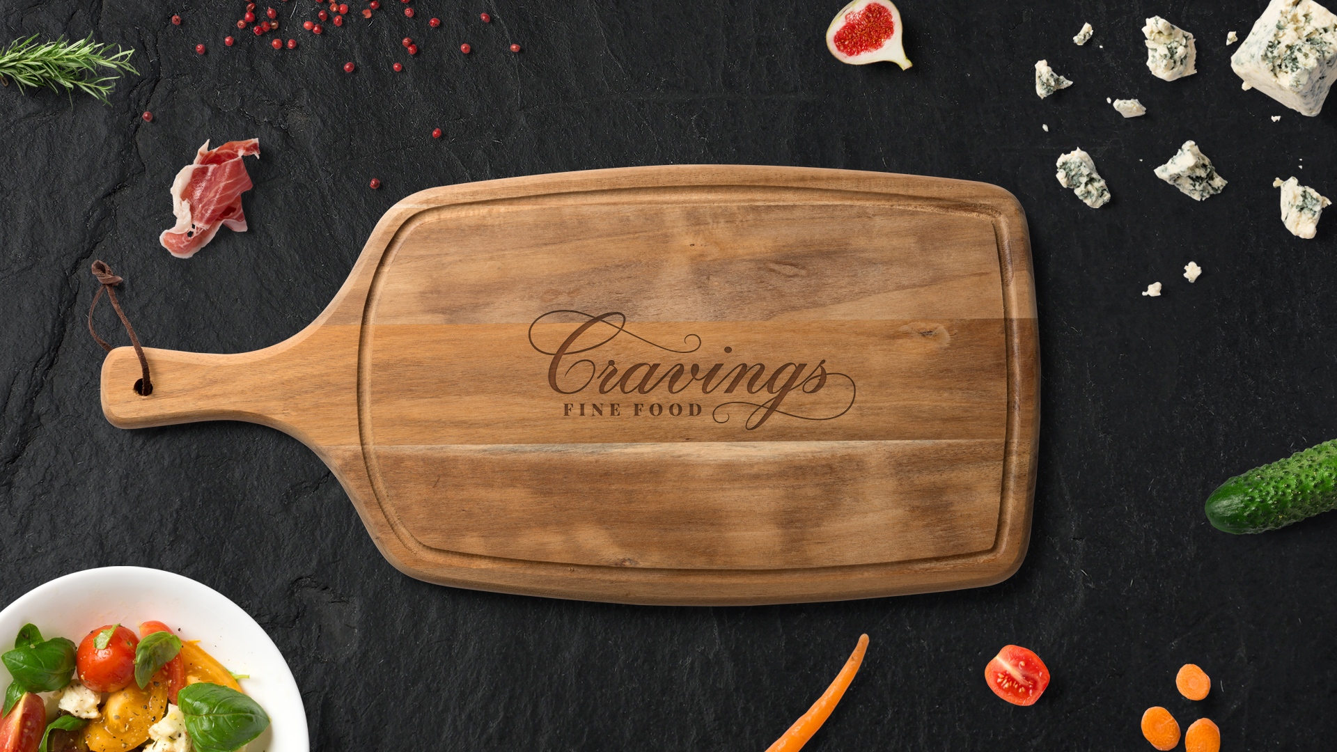
Cravings Fine Food is a homegrown Barrie business that specializes in catering for both corporate and private events. The business operates from a storefront that offers dine-in specials as well as pre-made meals. Cravings had approached the agency looking for a logo refresh. Their current logo carries strong brand equity however, the company has had issues balancing the logo on various forms of collateral as the flourish on the end of the letter “S” created an asymmetrical shape. I decided to update the script typography using the regular version of Kuenster Script while thickening the downward strokes to make a custom Demi weight cut. The recognizable flourish on the end of the wordmark loops back into the center while adding an identical flourish to the initial “C”. This created a balanced logotype that mimics an infinite loop symbolizing connection and togetherness. Through working with the client I was able to create the companies brand guidelines which incorporate 3 main colours for the brand for different sectors of business as well as business cards, storefront signage, package labels, stickers, and custom stamps for each of the logo lockups.
Client
Designer
Anthony Mika
Agency
Larche Agency
Creative Director
Karen Evans
Date
March 1, 2019