Gerrits Engineering
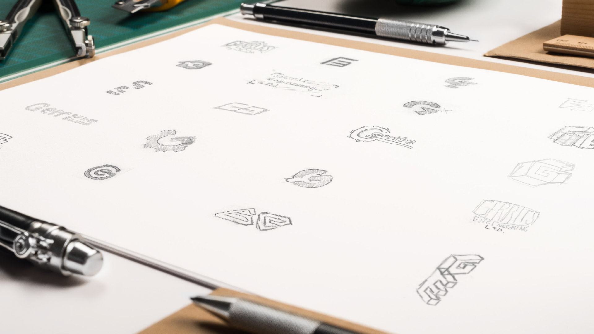
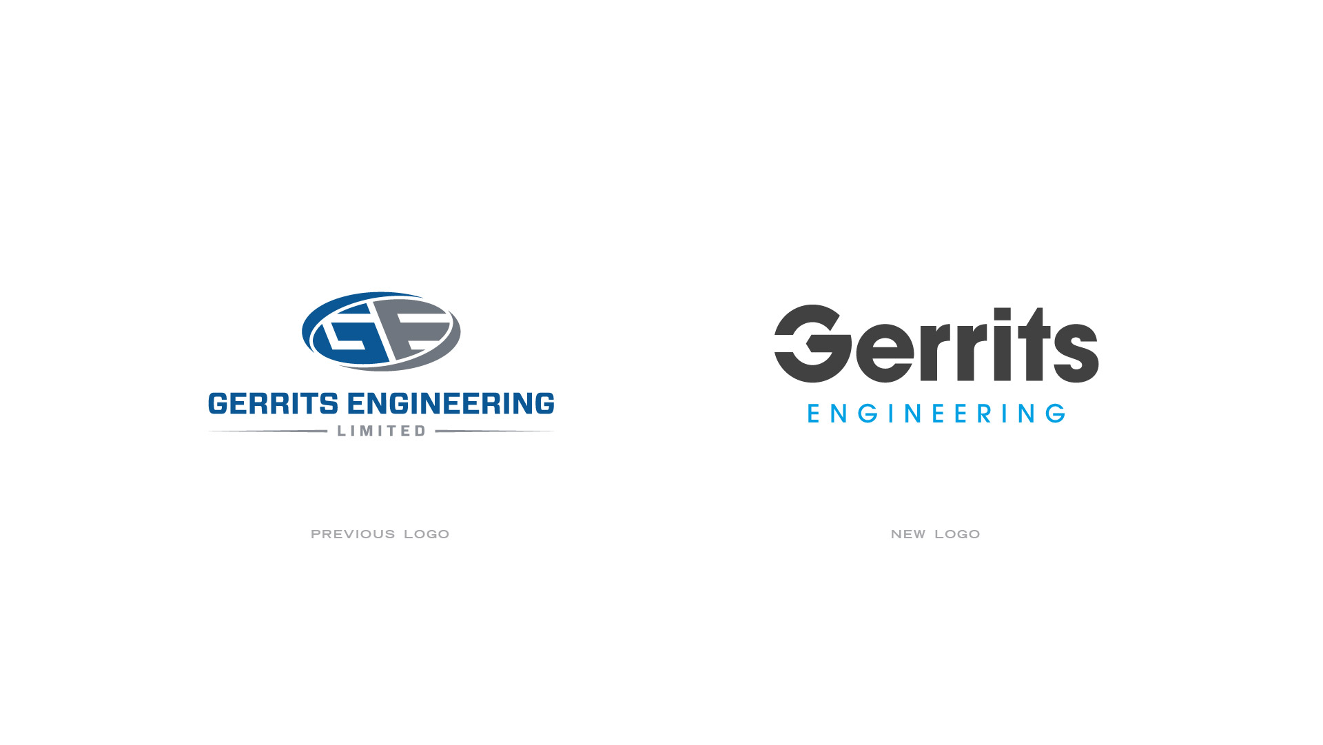
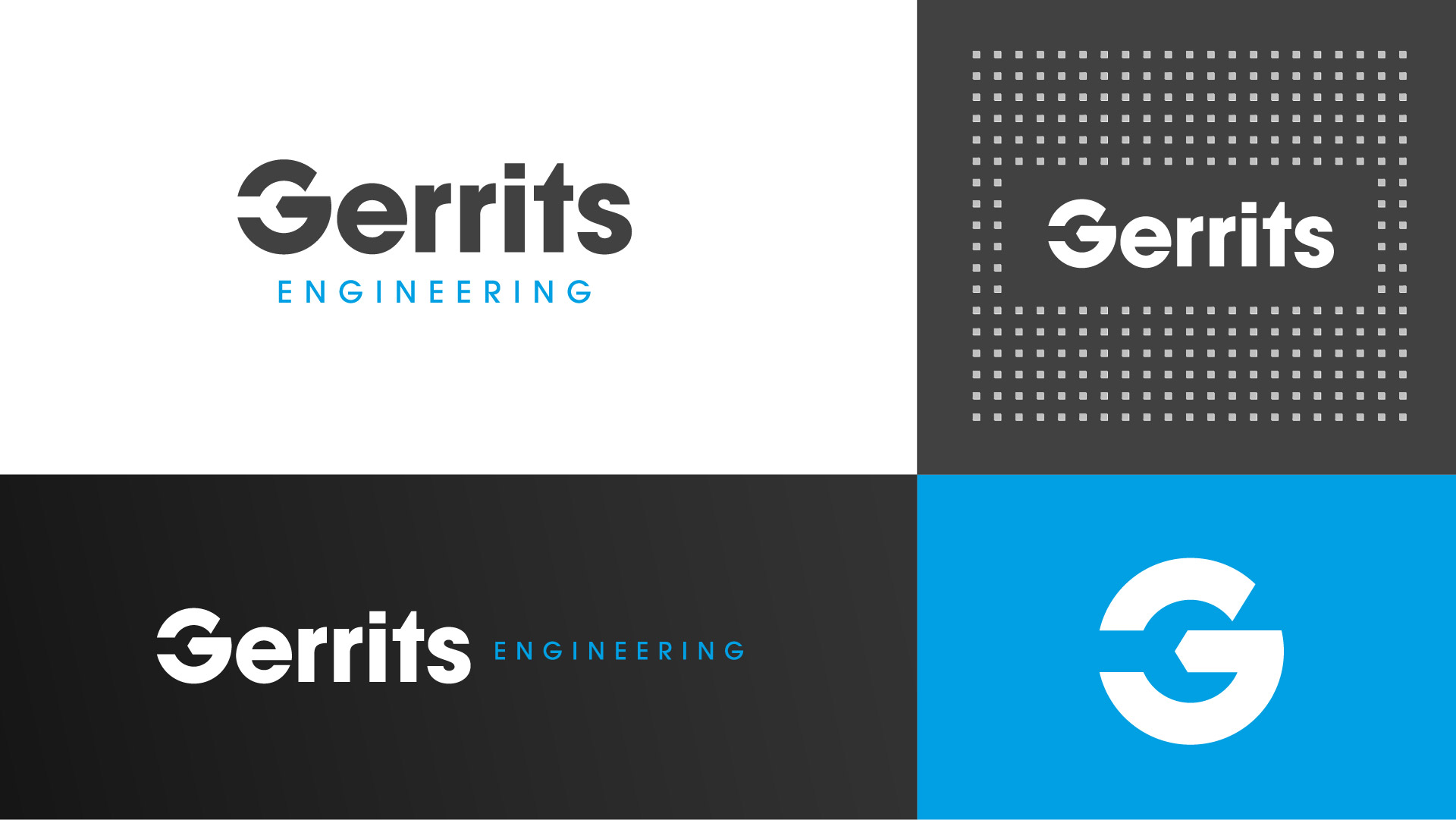
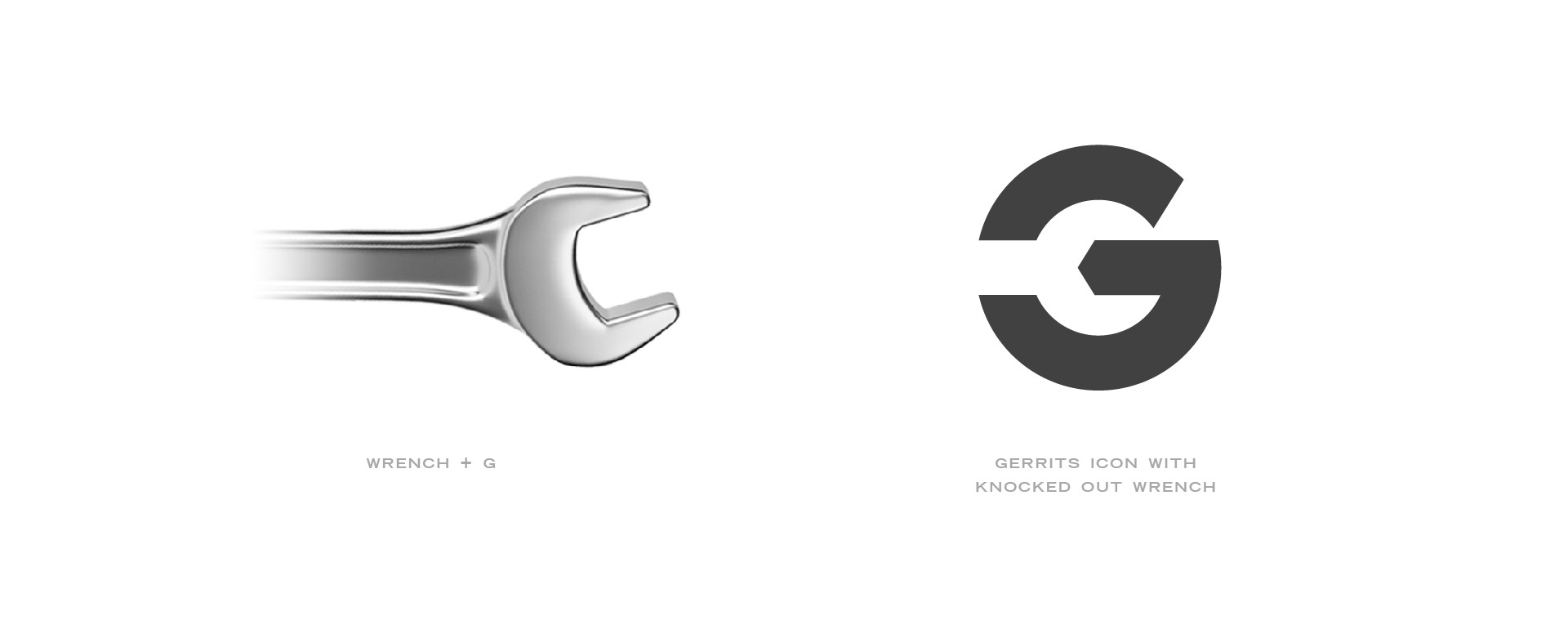
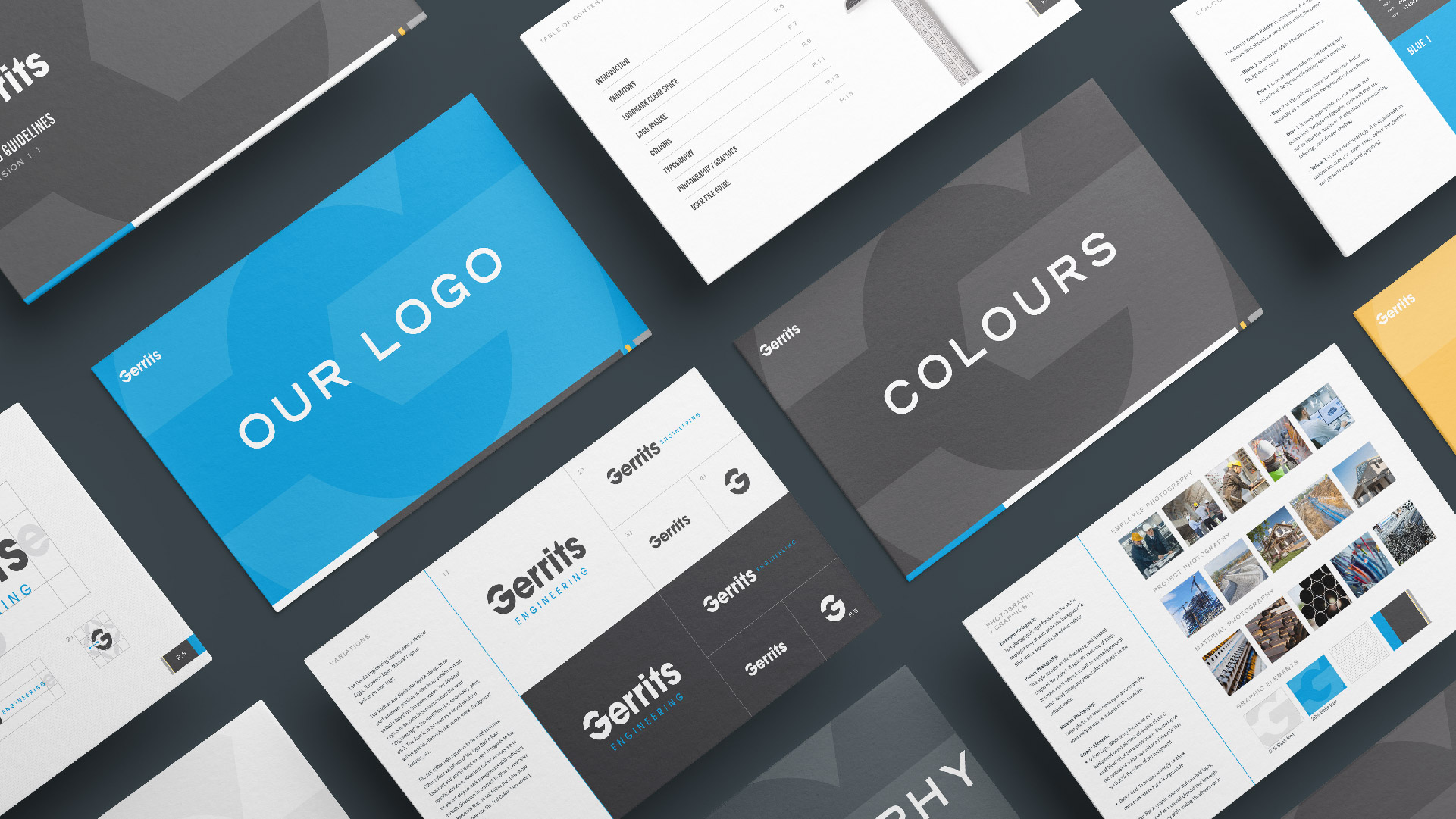
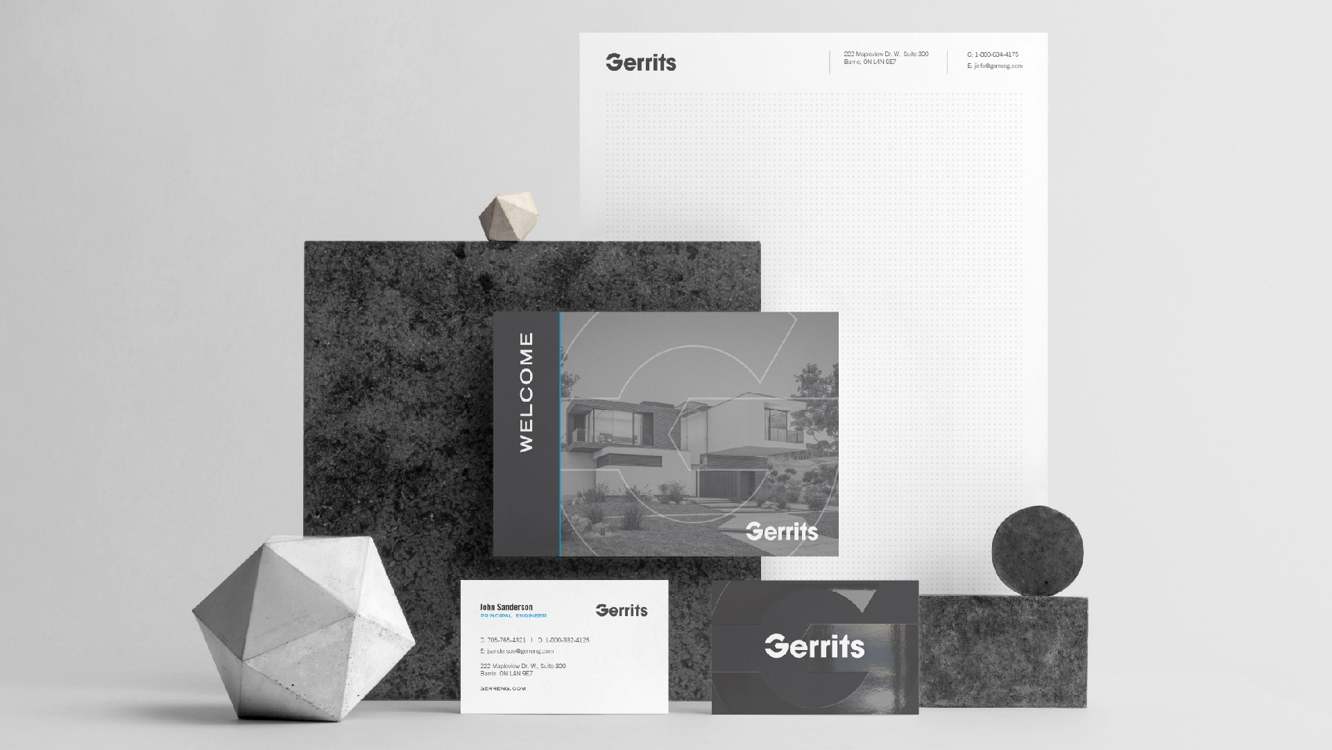
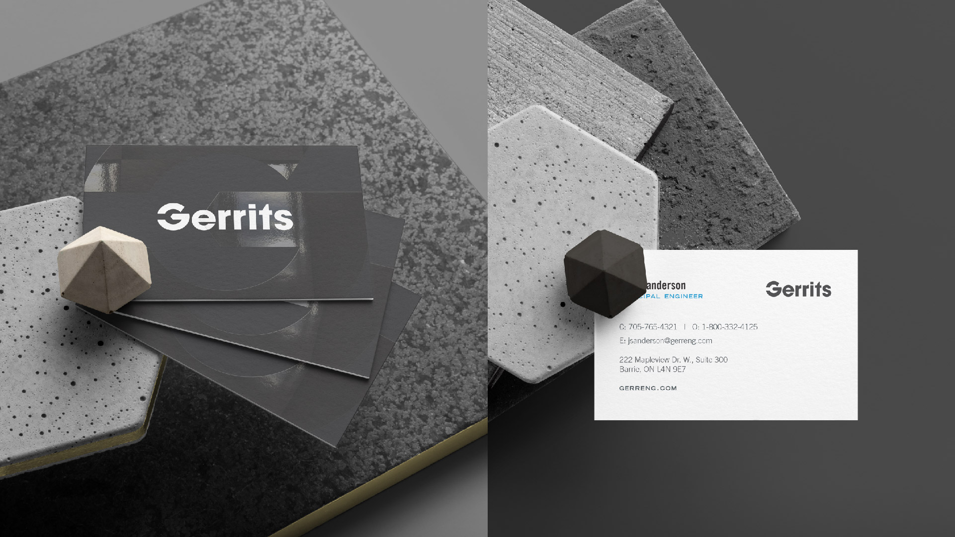
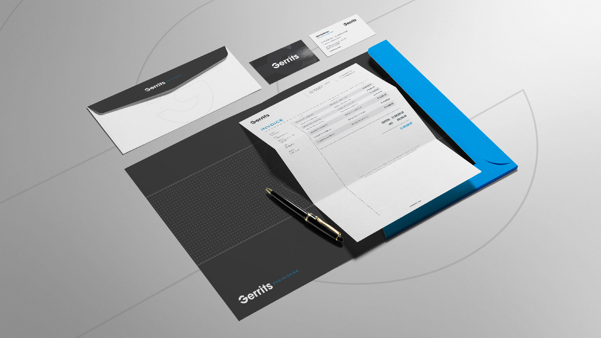
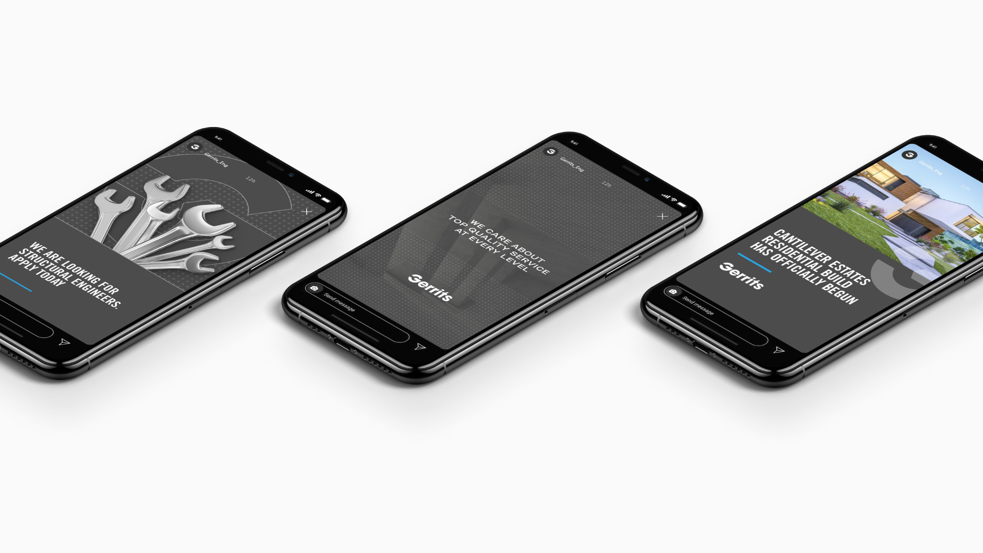
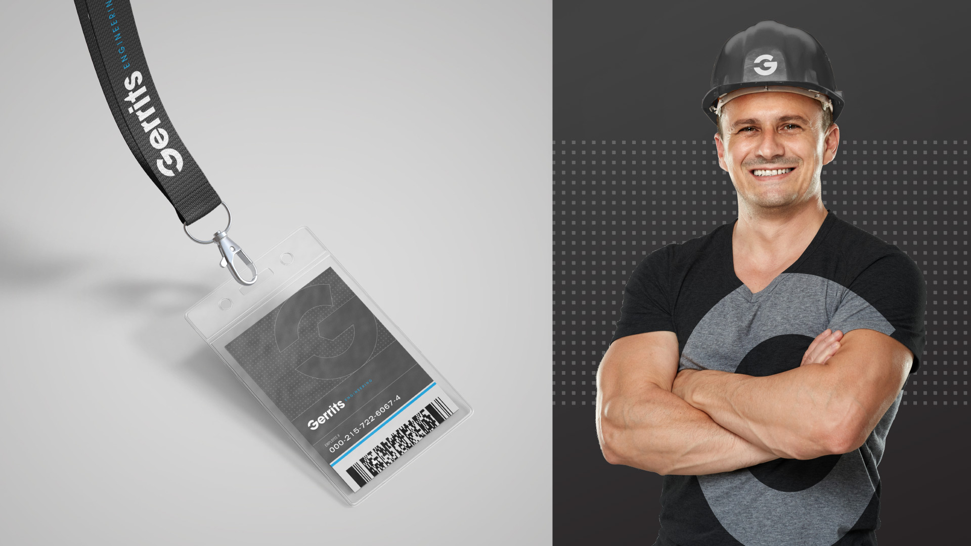
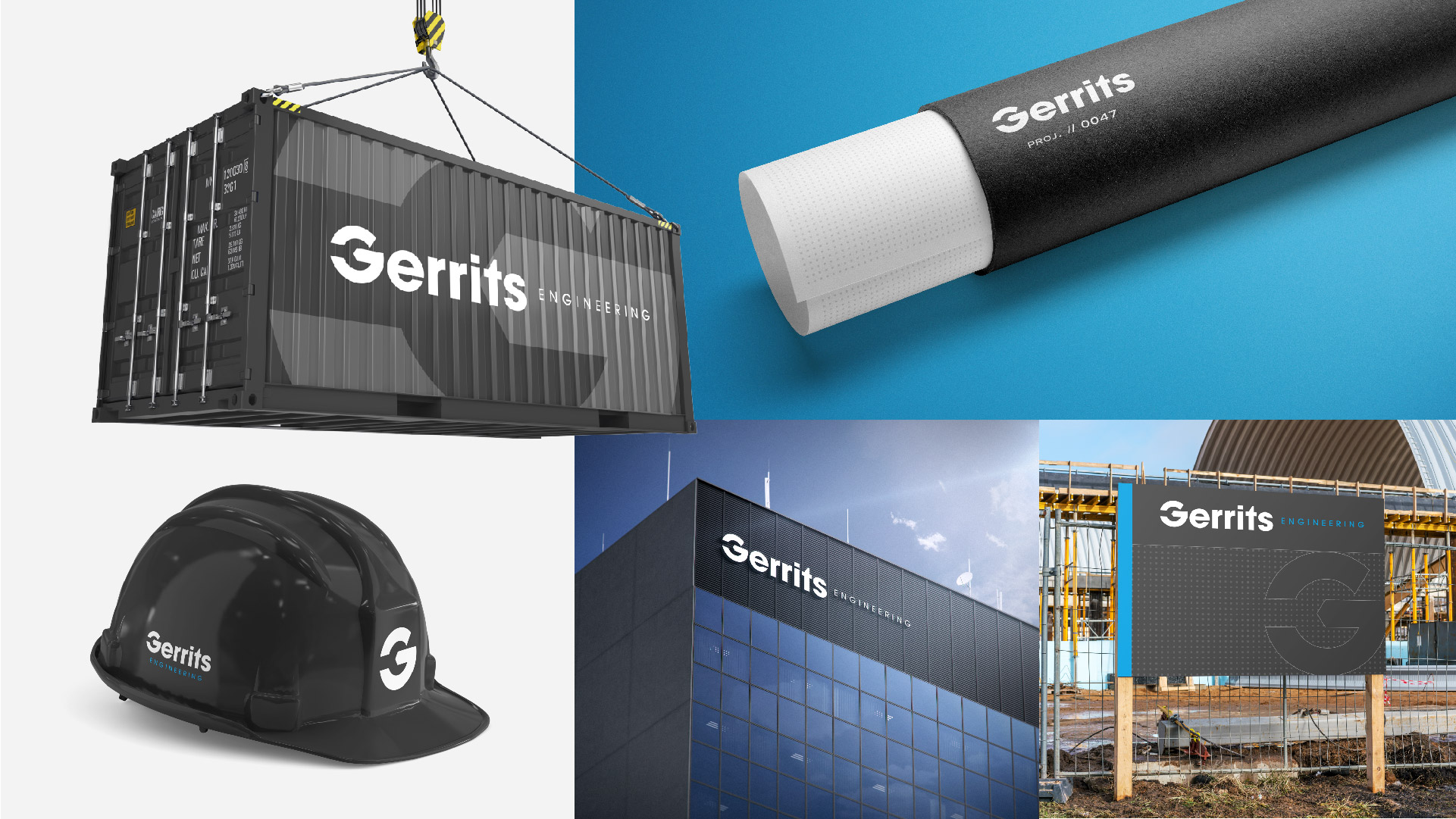
Gerrits Engineering is a firm that specializes in all areas of engineering. The core value of their business is to provide the highest standard of workmanship while matching their friendly and approachable demeanor. Gerrits came to the agency in search of a recognizable identity that projects strength and approachability in their brand. The logotype uses a bespoke version of ITC Avant Garde that incorporates a wrench knocked out of the initial “G” icon. The “T” in the logotype incorporates the same angles used within the “G” to not only follow repetition but also to instill a feeling of sharp robust strength as noted in the companies standards. The accented use of the light blue hue as well as the geometric roundness in the typography help to solidify the friendly aspect in their values. During my time at the agency I was able to work alongside Gerrits Engineering to solidify their brand guidelines by helping with such items as brand photography, social media design, & company-wide business cards.
Client
Designer
Anthony Mika
Agency
Larche Agency
Creative Director
Karen Evans
Date
June 1, 2019