Unitas Hockey
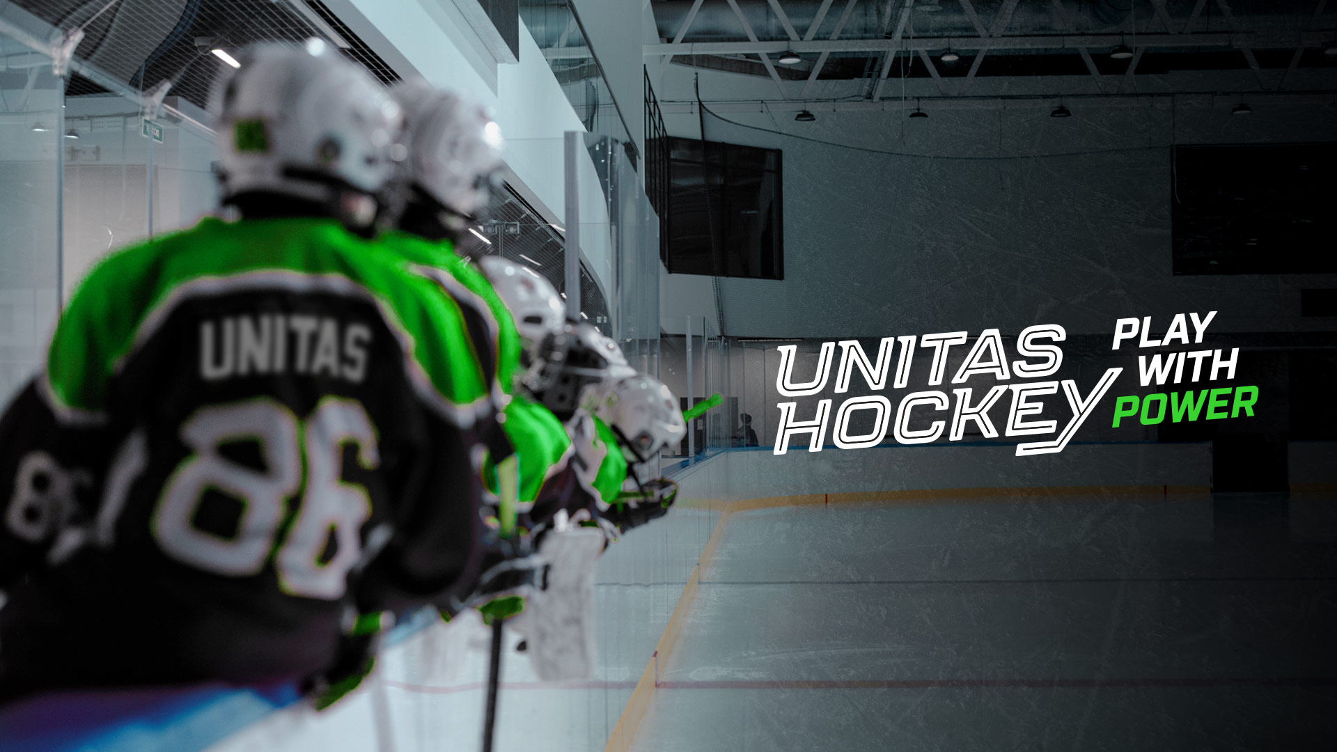
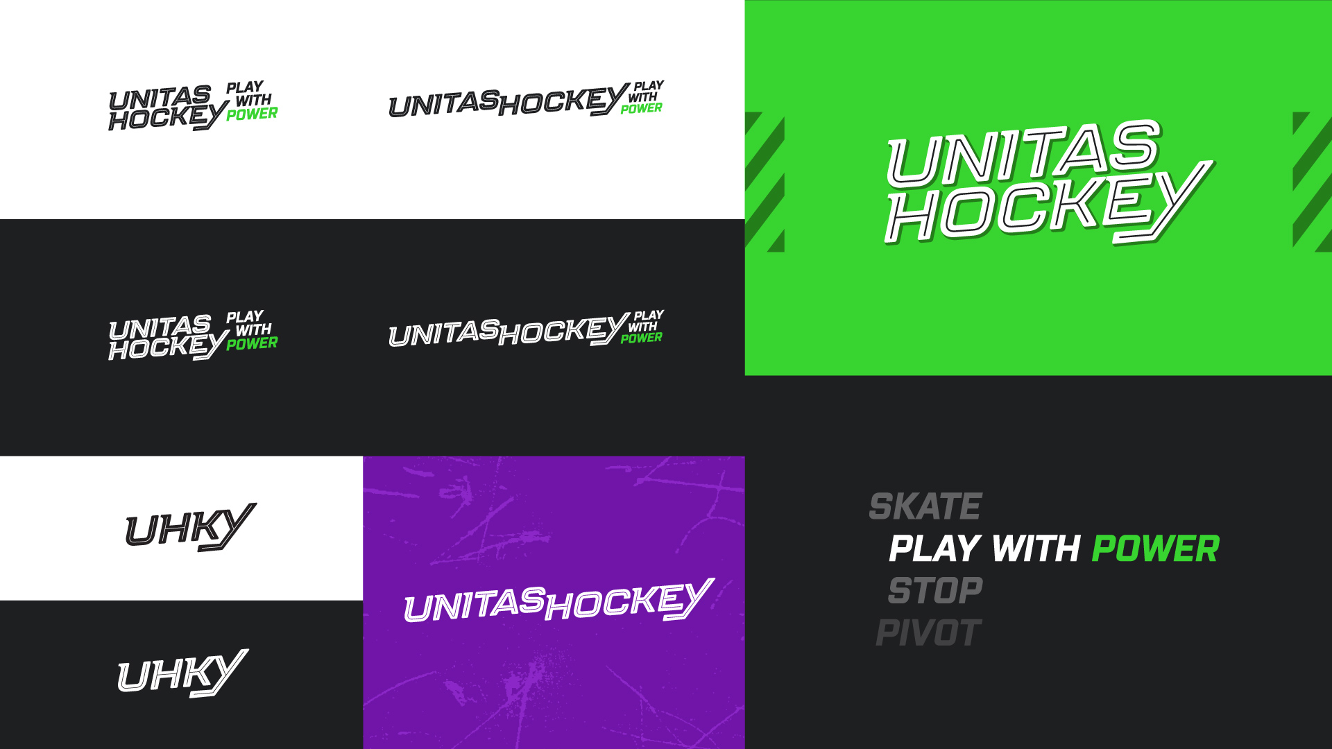
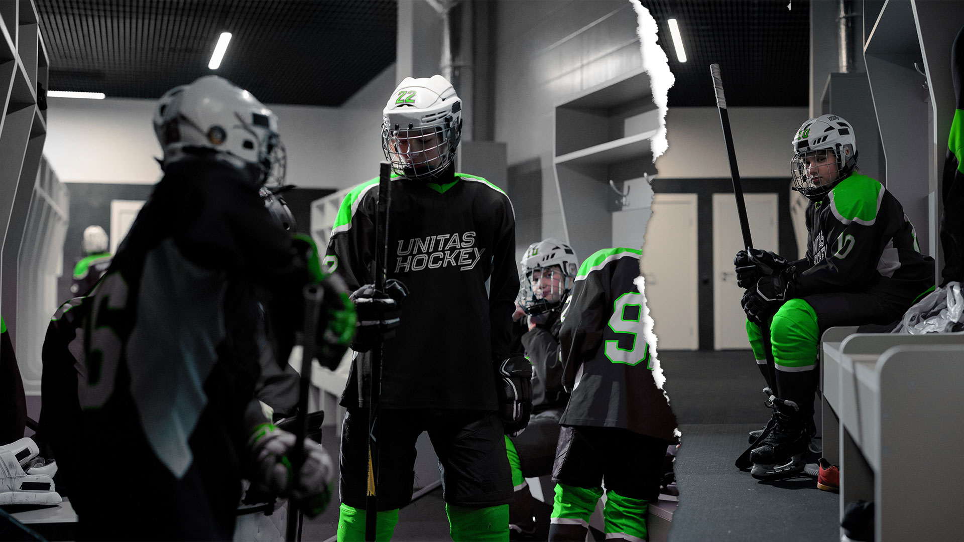
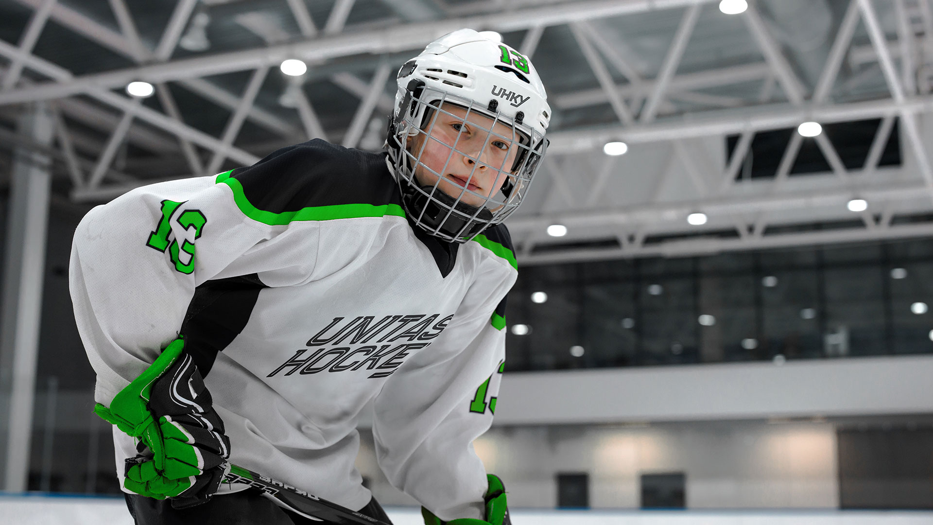
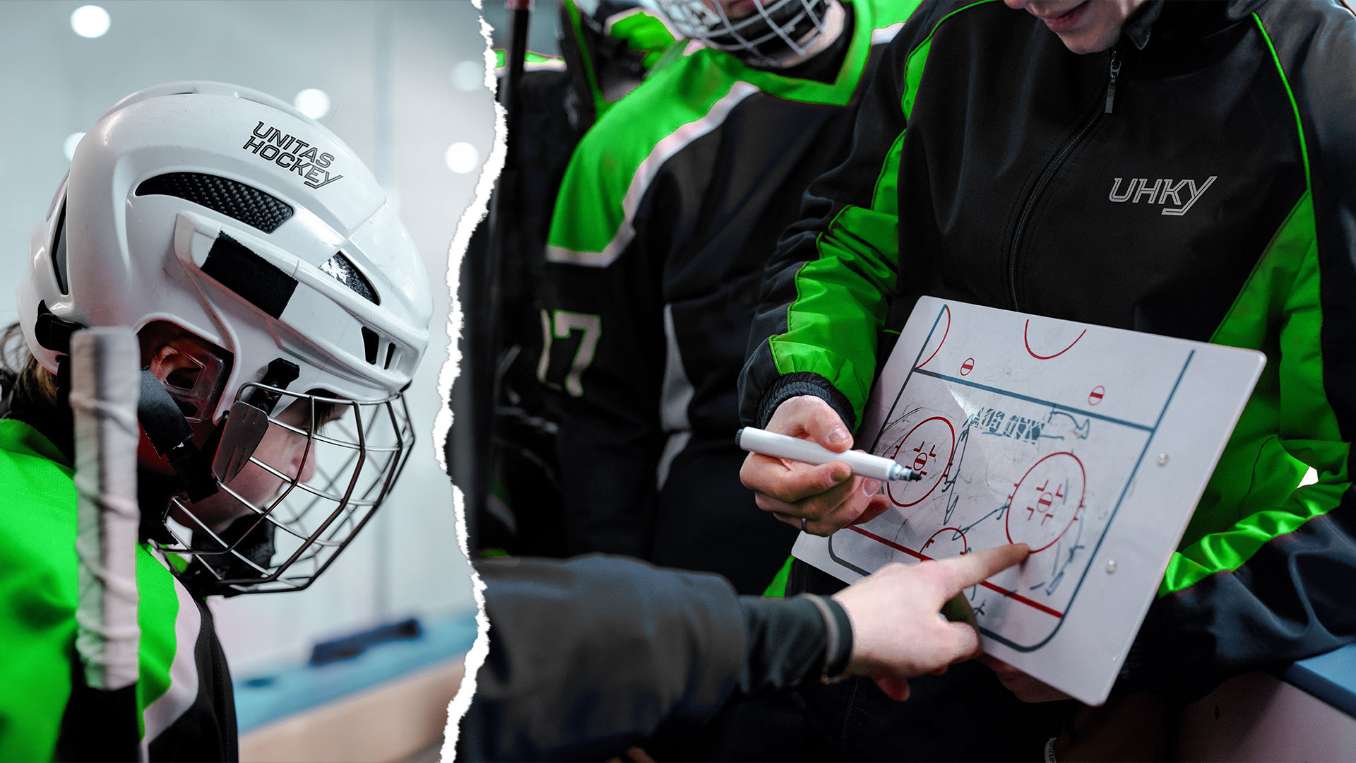
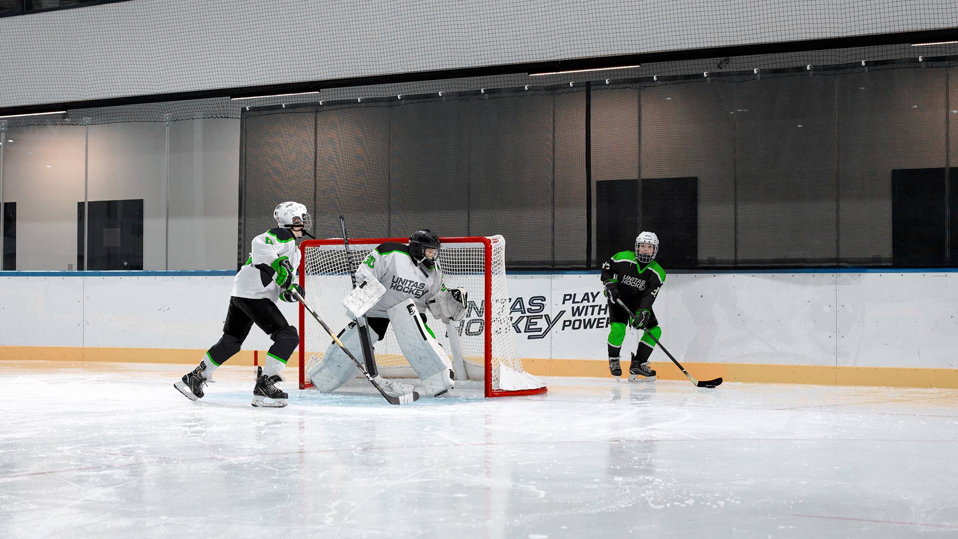
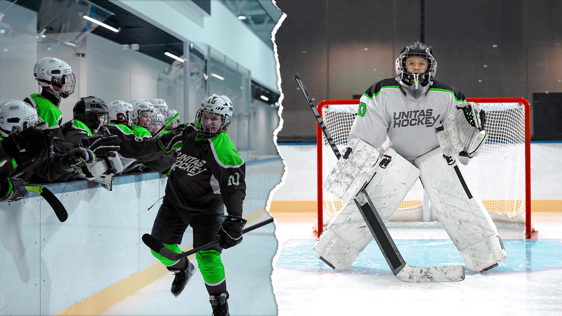
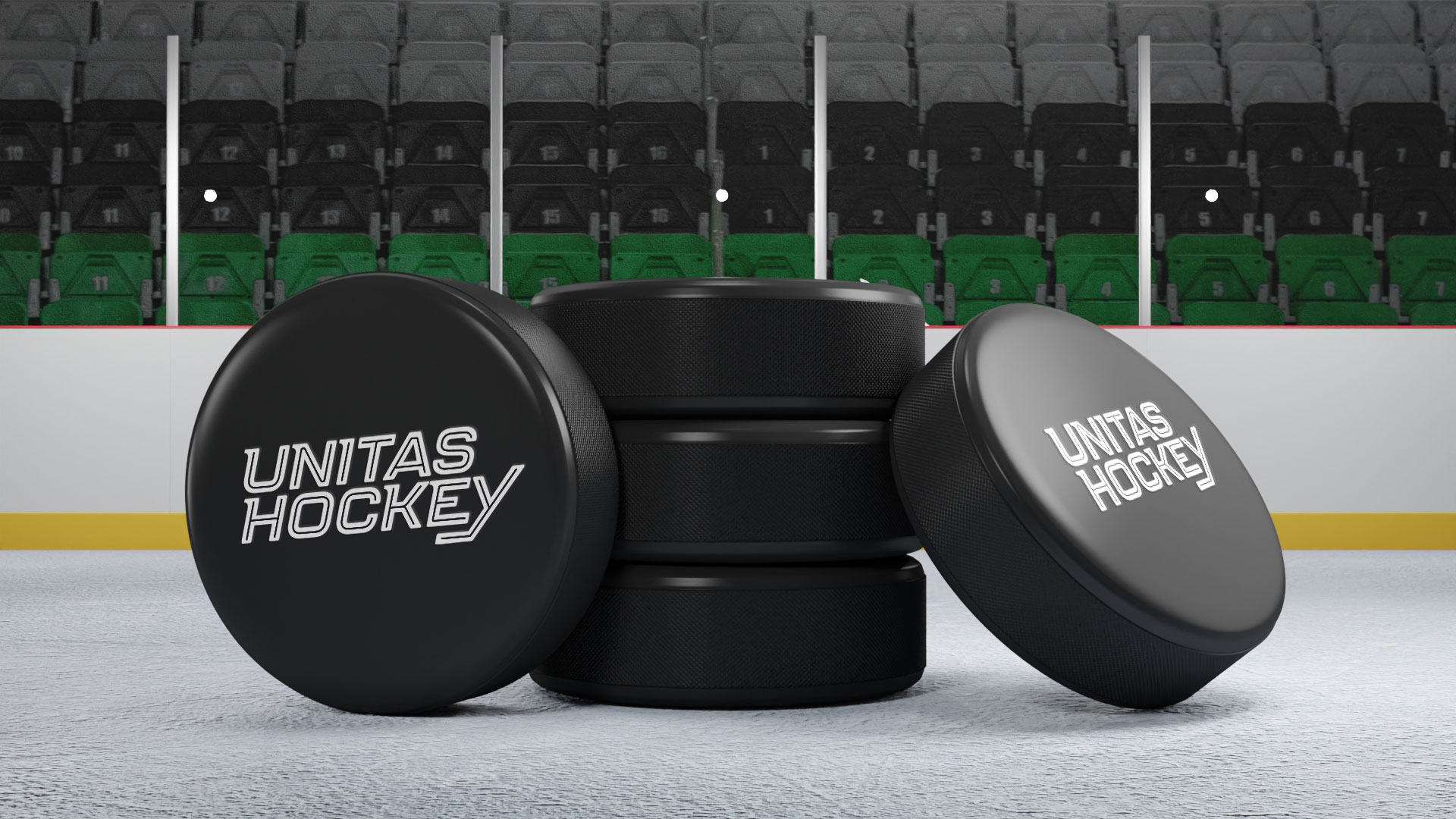
Unitas Hockey is a Hockey training skills school that has been in business since 1986. Their tried and true work ethics are proven in helping thousands of youth hockey players to play with power. The team over at Unitas approached me to collaborate on a new visual identity as well as a tagline. The update needed to build off of their existing brand loyalty while injecting a modern hockey vibe. We kept the recognized inline type characteristic for the word mark while incorporating forward motion and skate-like serifs into the updated typography. The upward motion promotes positive growth with a subtle nod to a hockey stick in the descending stroke of the ‘Y’. The development of the tagline meshes the aspects of reason with the benefit behind their service. A game that is played for fun, and training of skills that develop power. Two contrasting qualities which make up the sport. With recognized brand elements, a relatable brand message, and a unique colour palette to associate with hockey the Unitas Hockey brand refresh powers through the competition asserting their years of experience.
Client
Designer
Anthony Mika
Date
December 7, 2021